|
Size: 2667
Comment:
|
Size: 3110
Comment:
|
| Deletions are marked like this. | Additions are marked like this. |
| Line 9: | Line 9: |
| The following graphs show the results of the numerical questions from the first 49 surveys returned by April 16. These will be updated as more surveys are received. The anlaysis of the "free form" questions will take longer. | The following graphs show the results of the numerical questions from the first 101 surveys returned by April 19. These will be updated as more surveys are received. The anlaysis of the "free form" questions will take longer. |
| Line 12: | Line 12: |
| ||Its histogram shows this. The heights of the bars show the number of surveys that gave each score for this question.||{{attachment:HolyHisto.jpg}}|| ||It is also apparent from the averages plot that the time questions have large spreads. The plot to measure diversity is opposite. Each question has a position on the graph, vertically the number of +3 (essential) answers, and horizontally the number of -3 (won't come) answers. The two questions with 9 "essential"s are Organ and Choir.<<BR>>Questions towards the middle of the plot show incompatible opinions. For example, a time of 11am has 6 respondents who will only come at 11, and 5 who will never come at 11. Interestingly the other characteristics of services appear much less contentious so far.||{{attachment:Extremes.jpg}}|| ||This is confirmed by looking at the histogram for that question||{{attachment:Time11Histo.jpg}}|| More analysis will be coming, including different ways of counting the positive and negative scores. |
||The 'sense of the holy' histogram shows this. The heights of the bars show the number of surveys that gave each score for this question. For 101 surveys, these can be read as the percentage of respondents.||{{attachment:HolyHisto.jpg}}|| ||It is also apparent from the averages plot that the time questions have large spreads. The plot to measure diversity of answers is shown opposite. Each question has a position on the graph, vertically the number of +3 (essential) answers, and horizontally the number of -3 (won't come) answers. The overlapping questions are Organ & Weekly communion at 15 +3 answers, and Modern songs, Electronic meda & Printed orders at 8.<<BR>>Questions towards the middle of the plot show incompatible opinions. For example, a time of 8am has 19 respondents who will only come at 8, and 17 who will never come at 8. Both 11am and 9am also have significant numbers of both extreme scores. Interestingly most of the other characteristics of services appear much less contentious so far.||{{attachment:Extremes.jpg}}|| ||This is confirmed by looking at the histogram for those questions, for example the 11am time slot shown opposite.||{{attachment:Time11Histo.jpg}}|| ||An alternative analysis is to sum the positive and negative scores for each question, shown opposite. Again, times dominate the points furthest from the axes, that is, the most contentious questions.||{{attachment:SumsOfScores.jpg}}|| |
Survey on worship services 2015
ChurchCouncil is always considering the number, style and timing of worship services. It was suggested at the congregational meeting in March that Council again canvas the congregation on the question of reducing the number of services. In response to this request, concil composed a survey. The survey focuses on examining the diversity of members' worship style preferences, to see if combining of services is possible. Questions concerning which services to combine and at what times, are not yet being considered.
The survey can be completed in paper form available at church or here, or on the web using this link. Completion before the Council meeting on 28th April will be helpful.
The following graphs show the results of the numerical questions from the first 101 surveys returned by April 19. These will be updated as more surveys are received. The anlaysis of the "free form" questions will take longer.
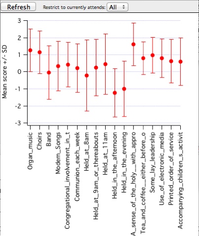
The first plot shows the average and standard deviation of the various questions."A sense of the holy" is the top performer. There may be different interpretations of what this means, and the spread of values is large, but it is clearly important to many people. Encouragingly, many of the features that are sometimes seen as contentious have mainly positive responses, including various music styles, use of electronic media, and the inclusion of children. |
|
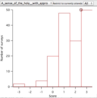
The 'sense of the holy' histogram shows this. The heights of the bars show the number of surveys that gave each score for this question. For 101 surveys, these can be read as the percentage of respondents. |
|
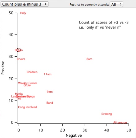
It is also apparent from the averages plot that the time questions have large spreads. The plot to measure diversity of answers is shown opposite. Each question has a position on the graph, vertically the number of +3 (essential) answers, and horizontally the number of -3 (won't come) answers. The overlapping questions are Organ & Weekly communion at 15 +3 answers, and Modern songs, Electronic meda & Printed orders at 8. |
|
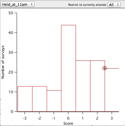
This is confirmed by looking at the histogram for those questions, for example the 11am time slot shown opposite. |
|
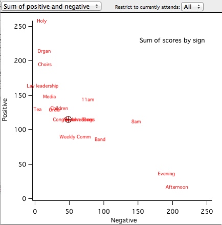
An alternative analysis is to sum the positive and negative scores for each question, shown opposite. Again, times dominate the points furthest from the axes, that is, the most contentious questions. |
|
Analysis by DavidMorgan
 The Glen Waverley Uniting Church PSALTER